Birmingham Community
Foundation Web App Redesign Case Study
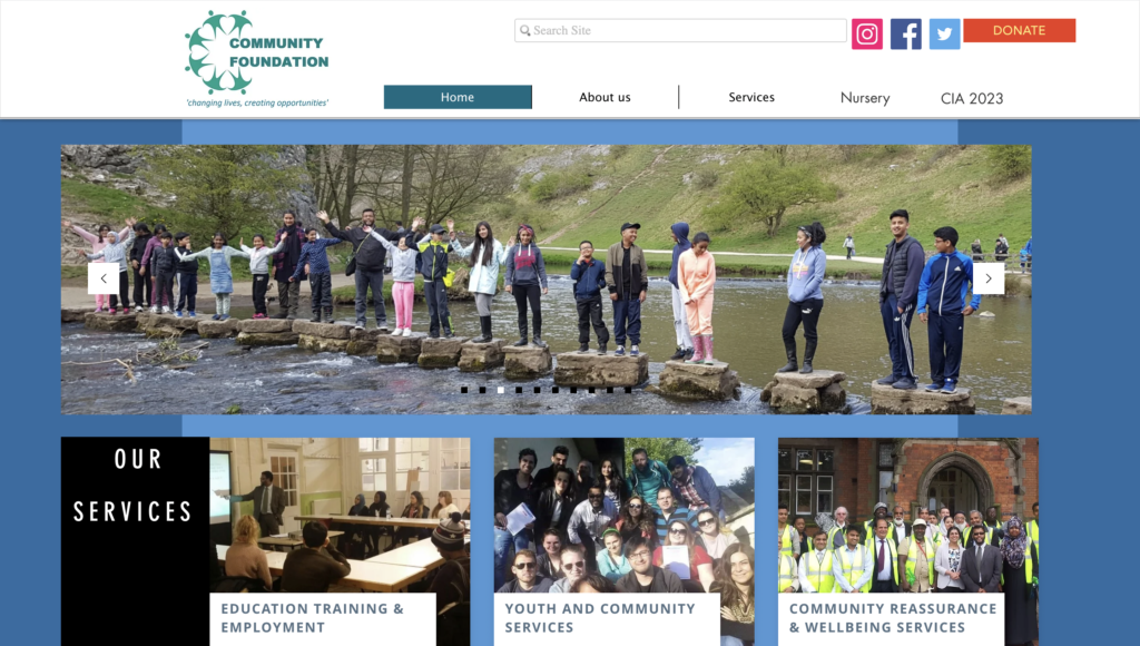
Birmingham Community Foundation is a digital platform for individuals within the local Community, it enables users to be well integrated with activities and development of their community.
Research Goals
To gain insights into the user needs and create a seamless and user-friendly experience for the community, our team embarked on a comprehensive user research initiative. This involved conducting interviews and surveys to understand the usability pain points of the website and address any usability issues faced by the target audience and stakeholders of the community foundation website.
Design Process
Empathise
Define
Ideate
Prototype
Launch
User Research
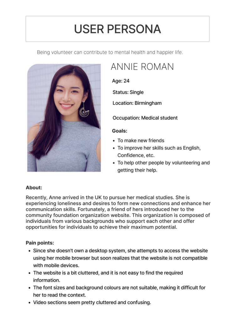
User Persona
This makes it easier to create an interface that meets the need of a wide range of users
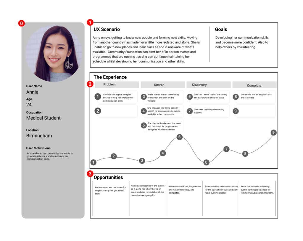
Based on the user research we created a user person to better understand the user needs and their pain points.
Annie, a new medical student in the UK, underscores the importance of empathy in digital platforms like the Community Foundation website. Beyond information, it serves as a lifeline, addressing loneliness and fostering connections. Annie’s persona highlights the need to understand unique user needs for a website that genuinely enriches lives.
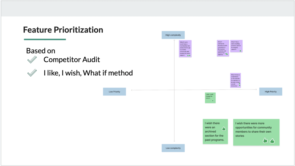
Feature Prioritization
Story Board
From our user scenario which is “Annie who enjoys to meet people and learn new skill whenever she’s in a new location”. We created a storyboard which was further used to create our user flow.
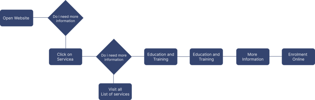
User Flow
The use flow was created to visualize and understand the path a user takes to complete a task within a product or service.
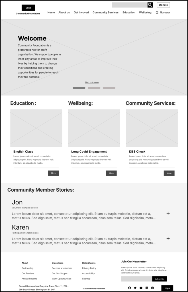
Lo-Fi Wireframe
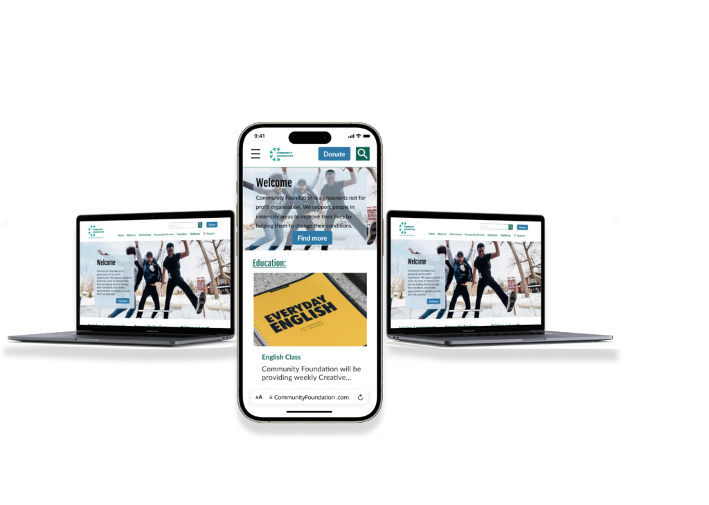
My colleagues and I began creating a responsive web interface. We divided into two groups for mobile and desktop design. In the web design team, my role involved crafting designs from low to high fidelity. Despite working separately, we united as a team to assess both designs, provide feedback, and iterate collaboratively.
Usability Test Plan
Usability Test Insight
Objectives:
Assess if the primary task can be carried out.
Evaluate the information Architecture of the website
Discover any user pain points
Test Insight and Solution:
Inappropriate CTA’s label – Changing the label and size
Blocked Path – A modal
IA/Site map – Revision on the site map
Clarity on external link – Using an icon on the external links
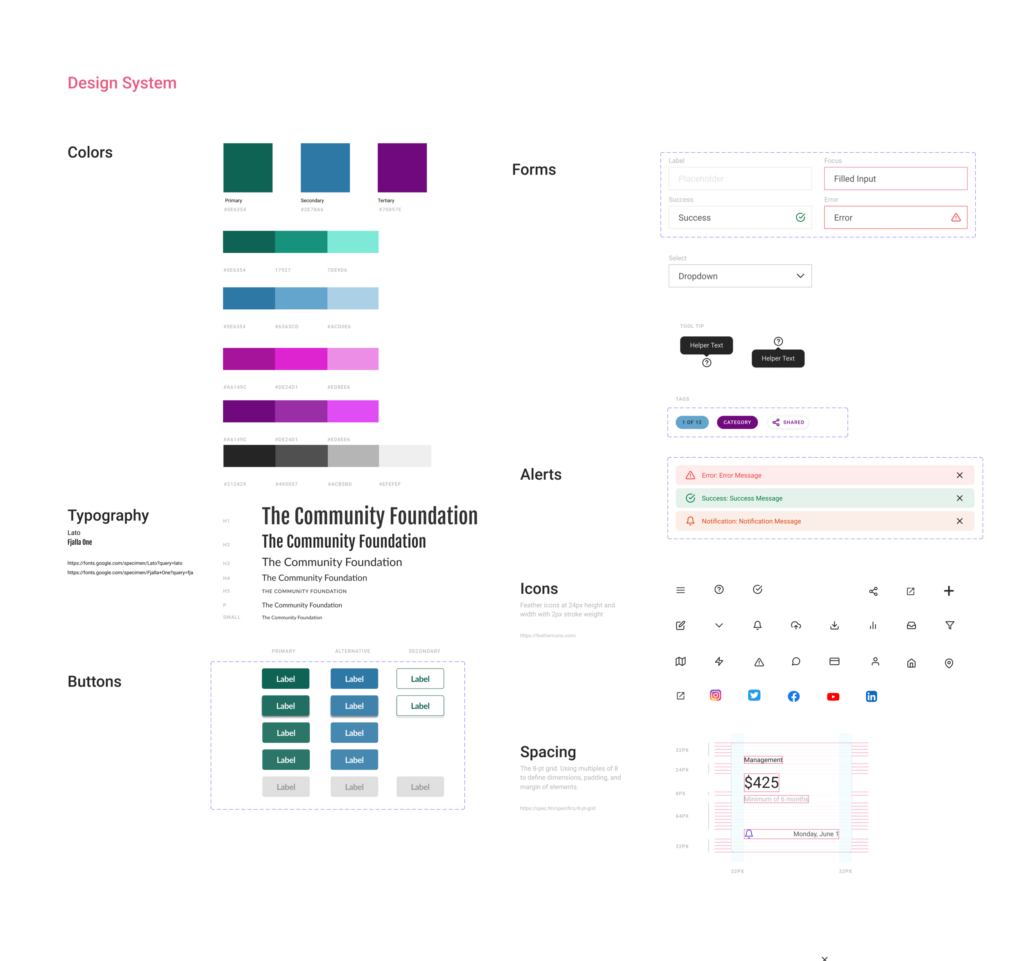
Design System
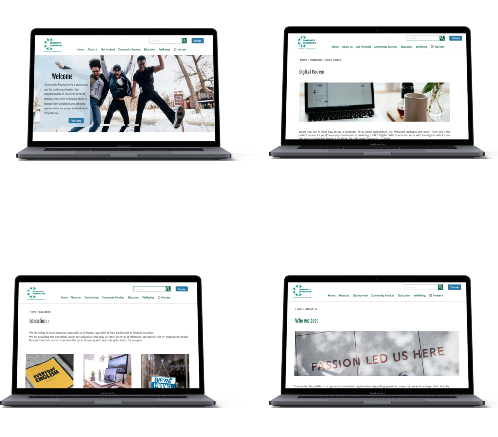
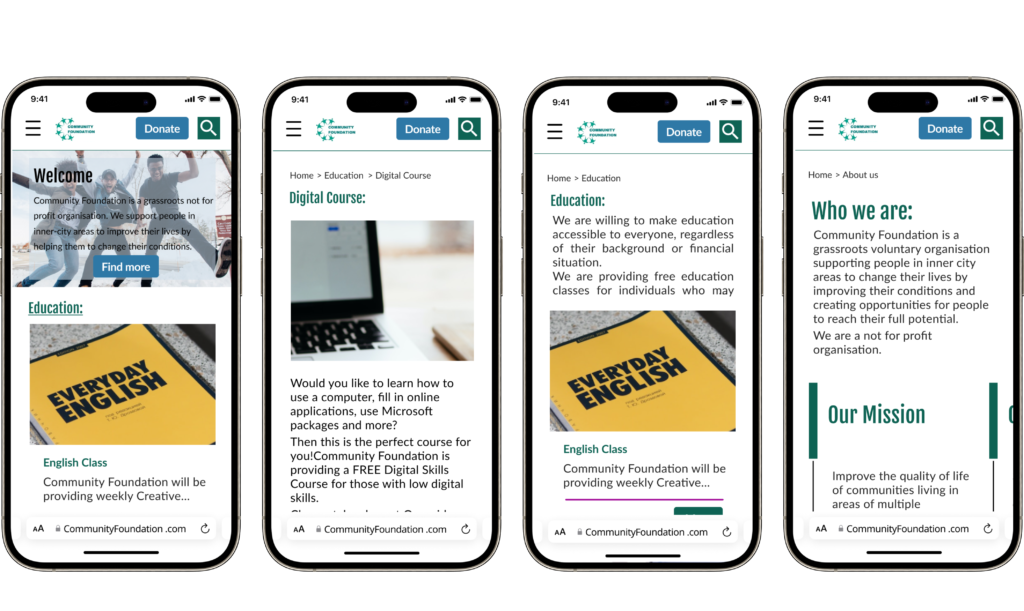
Hi-Fi Wireframe
Summary / Conlusion
Time was greatly spent on the IA (Information Architecture) because clarifications had to be sought from the stakeholders regarding terms used (services and project) and then reiteration was made to provide a clear navigation.
User testing and Iterating the user flow and site map enabled us to understand users need and task goals for the platform.
Accessibility was greatly thought of throughout the redesign, such as the typography, colour and UI pattern placements.
Future developments to include a profile page which allows user to track their progress of programmes they have enrolled on.